The Pan Asian Collective is an institution of the Netherlands that serves as a platform for integration, networking and co-creation of asian communities in this country. In 2023, the PAC, short for Pan Asian Collective, was ready for a Rebranding that could reflect the values of this institution and the personas of those that form it.
Developing a new identity for PAC meant creating a visual language that encompasses asian values and culture, thus traveling through a myriad of rich symbolism and ancient civilisations. Mapping the asian culture via research and data was key for establishing a solid foundation that can express the ethos of their communities and connect with the audience by generating a sense of belonging.
Asian communities have a common ground that is driven by several values or modus vivendi, among them: spirituality, strong sense of hierarchy, respect for the elderly, tradition, sense of collective, hospitality.
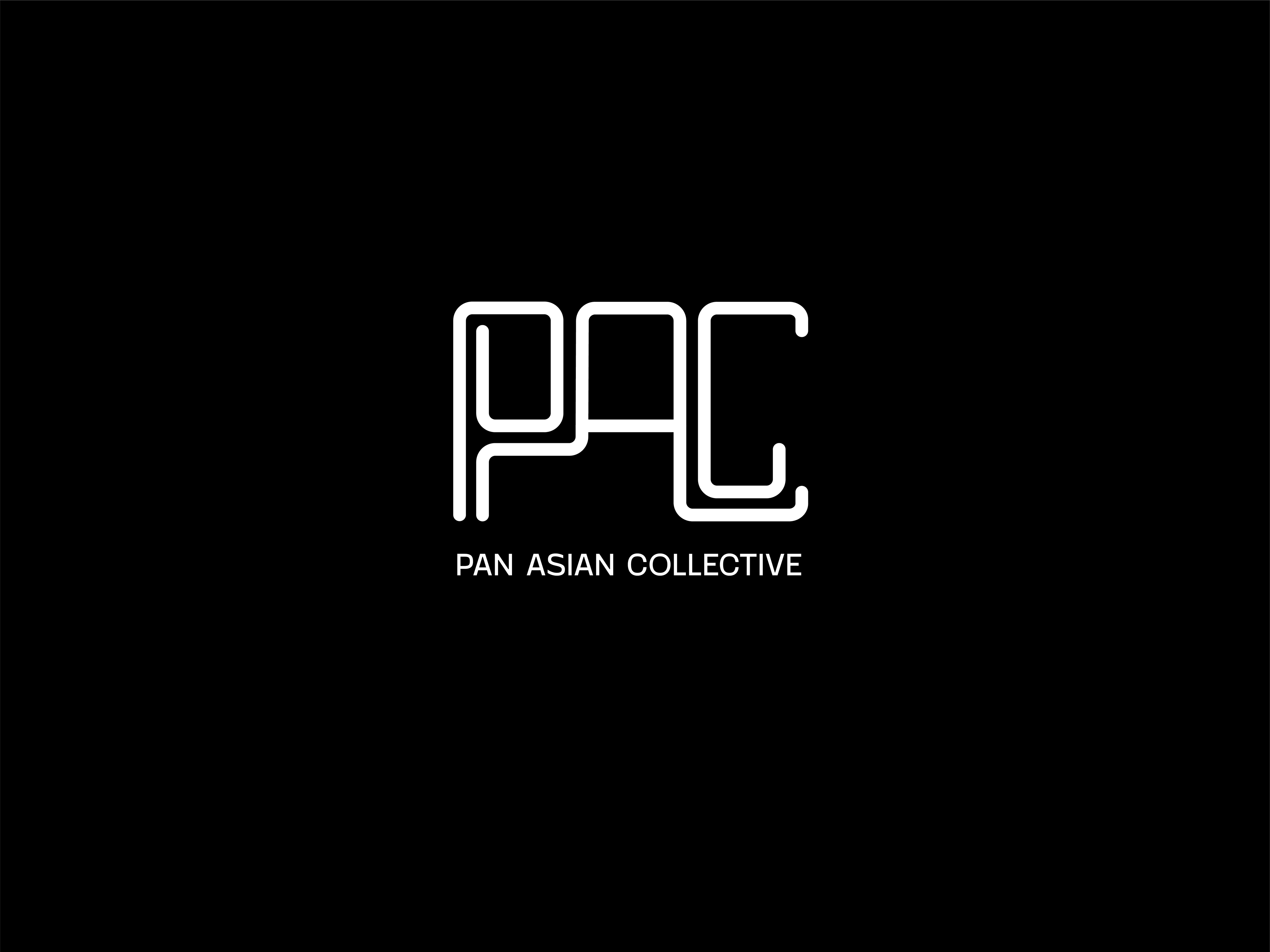
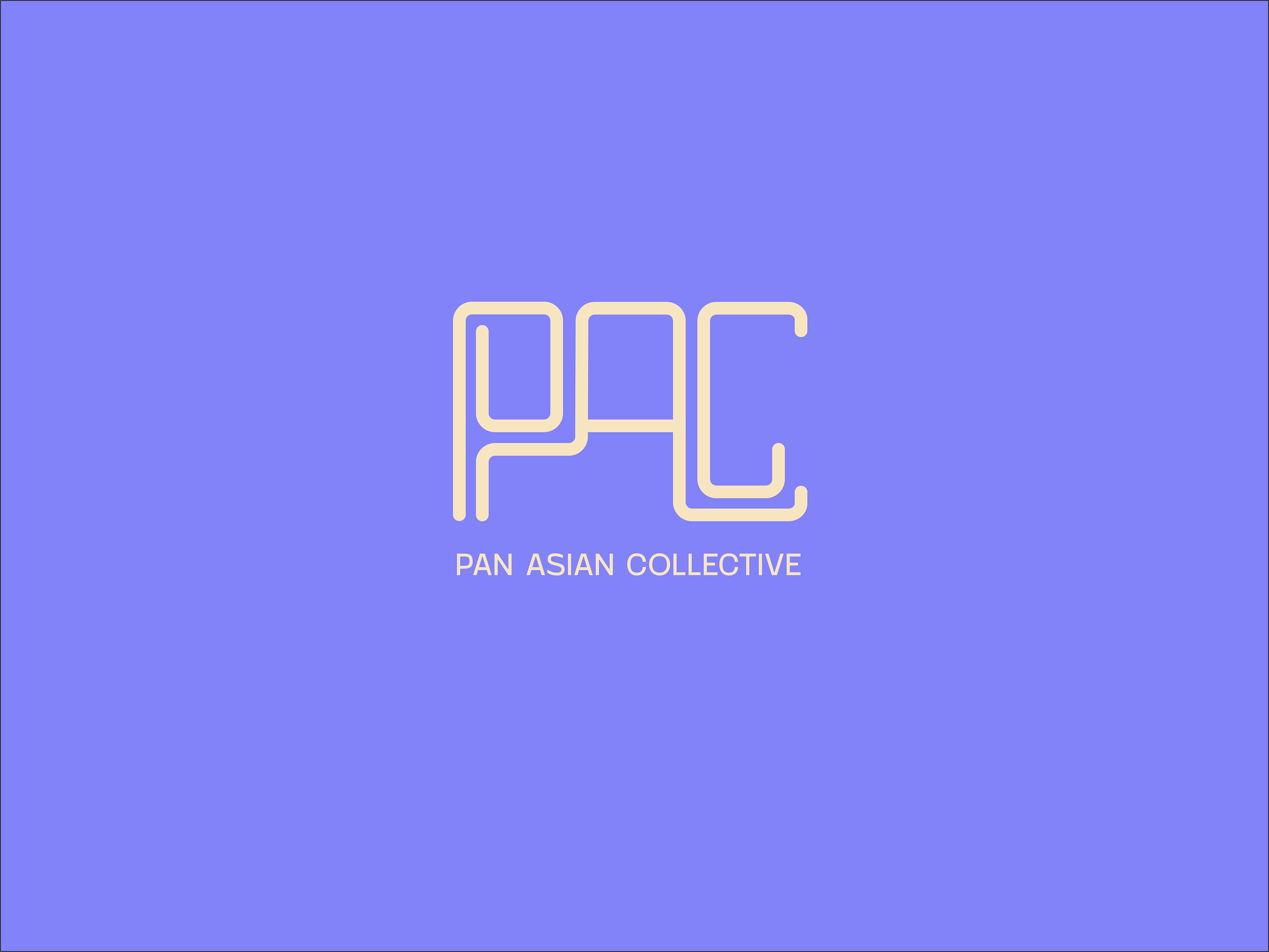
The proposed emblem represents the path of connectivity and socialisation. It is based on the symbolism and abstraction of the many eastern calligraphic styles. The three letters P, A and C embrace the spirit of the three personas of the Pan Asian Collective. Letter P embraces the persona seeking for co-creation, letter A the one seeking for networking and C, the one longing for integration. Ultimately, the emblem becomes the collective and the collective the emblem.
This project was executed alongside Gaby van Wijk, former TomTom Creative Director.